

What Milken’s Rebrand Means for the Future
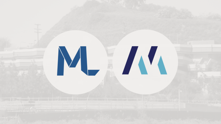
Photo provided by Spencer Davis
Milken’s old logo pictured on the left. Milken’s new logo pictured on the right.
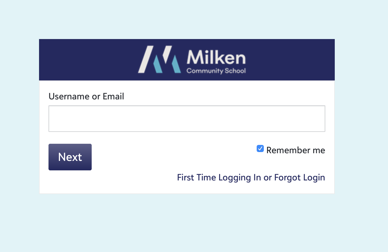
Logging onto MyMilken for the first time after a long summer, students were greeted with a fresh, new look for Milken this past fall. The welcome page featured a light blue backsplash with dark blue accents and Milken’s new minimalist logo sitting at the top of the page. While this may have come as a surprise to students, this was part of a fifteen-month process that started when Dr. Shulkind first arrived at Milken in July of 2019.
Through Dr. Shulkind’s informal discussions with parents, teachers, students, and alumni, the administration began to observe that Milken’s branding did not match up with the Milken that people knew or described. While well-liked by the community, the previous logo lacked the ability to capture Milken’s identity. So, Milken hired a design firm who helped do more formal brand research and execute upon the rebrand. Starting their process with student surveys and various interviews, the team developed Milken’s new logo, its visual style, and its verbal system, which is how Milken identifies itself with different words and phrases.
Coming from an interest in visual arts, Dr. Shulkind said she cared about Milken’s brand and “what that communicates about the school.” She wanted the new brand to do exactly that, communicate our school’s mission and evoke that inner feeling of Milken. Milken’s head of communications, Tal Barak ‘96, and Milken’s marketing manager, Zechariah Morrow, really led the process of rebranding.
The rebrand began by developing the verbal system, which is a network of different words and phrases that the Milken administrators use to describe the school in various applications. First, the team created brand pillars, and translated them into positioning language. One pillar, for example, was that “Milken is a place for self discovery.” The team translated that brand pillar into various phrases like “every dream starts with a journey, every journey with a single step,” Ms. Barak explained. These pieces of positioning language are meant to capture the Milken experience and guide Milken’s promotional material, appearing on the Milken website and in other promotions for the school.

The strategic leadership team, in partnership with the Board of Trustees, also rewrote Milken’s mission, their core values, the education philosophy statement, and tweaked the Portrait of the Graduate. Milken’s new core values define the school as a welcoming community with kindness and a connection to Israel. Some of their new core values include Arievut, responsibility for you and others, Kehila, building a welcoming community, and more.
The new mission statement states that “At Milken Community School, we think education is more than what you know. Our School, founded on Jewish values, is about who our children can become and how they can help others become who they might be. Because the world our children will create tomorrow is born in the School we build today, our mission is to educate our children so they can surpass us.”
Milken’s Open House demonstrated this consistent brand messaging. The new brand has given students, teachers, and parents “the language to describe who we are,” said Dr. Shulkind, to bring out the mission and inner vision of Milken. Dr. Shulkind even said that the language has given Milken “this whole backdrop by which we talk about anything difficult,” including the administration’s past email about election discourse at Milken and how Judaism dictates how we debate.
Visually, Milken’s new look incorporates these same brand pillars. The logo features the letter M etched into the negative space of four large geometric blocks. The stark blue and white color scheme reflects our connection to Israel, while the sharp, minimalist design seems to indicate that Milken is new, daring, and forward-thinking in their vision of education. Zechariah Morrow even says those large geometric blocks are even meant to “invoke images of the two tablets” and connote our Jewish identity. While these representations may not be clear upon first glance, the design firm’s goal was for the viewer to subconsciously derive meaning from Milken’s visuals. The new logo, visual system, and colors could be seen across Milken’s promotional material, emails to students and parents, social media, and all the Milken swag that students picked up later that day at the Welcome Parade. This consistent branding will define Milken’s look for the future.

Another important aspect of Milken’s rebrand was the student perspective, and how that influences everything at school. A group of 2020 graduates helped Milken develop the SLERP program, a team of students offering a young perspective to Milken’s admissions, promotion, and social media. Members of the SLERP teams have been creating content for Milken’s Instagram and TikTok, and even leading virtual tours for applicants. That same team of 2020 graduates played a key role in designing Milken’s new merchandise, communicating that wearability, especially for teenagers, was crucial to Milken’s clothing. This year, seniors Celine Behnam ’21, Dylan Shabbouei ’21, and Brandon Tavakoli ’21, helped develop a monthly student advisory committee, where juniors and seniors can get involved in the process of making some of the pivotal decisions that define the student experience at Milken. Student feedback has become crucial, from the brand identity to the day-to-day look and feel of Milken.
Ultimately, Milken has emerged with a clearer message: one that’s allowing the administration to focus on who Milken truly is, not trying to be “all things to all people.” Dr. Shulkind and the rest of the administrators hope this new branding will help foster pride for simply being a Milken student, not just for the various clubs and classes that students enroll in. Milken’s rebrand is not just about the external, with its different fonts and colors, but about how Milken communicates and connects with its community.

As a senior at Milken, Spencer Davis is in his third year writing for The Roar and his second year as the Co-Editor-in-Chief. Spencer joined Journalism...